
About Teacher Comparison
The Teacher Comparison is similar to the District/School Type, and District/School Type/School chart, however it also provides information down to the teacher level. The charts in this report work together to provide a side-by-side comparison of the SLO and Professional Practice data gathered for the entire District (top chart labeled ‘District’) against the teacher level data shown underneath (bottom chart labeled ‘Teachers’).
Multiple filters can be applied, such as Teacher Name, School Type, Grade Level, and School Name – these filters allow you to select multiple teachers and view their SLO and Professional Practice scores at once.
How to Use the Chart
To view this chart, open the Power BI file “ScoresComparison_Apr2” and navigate to the tab titled “Teacher Comparison”.
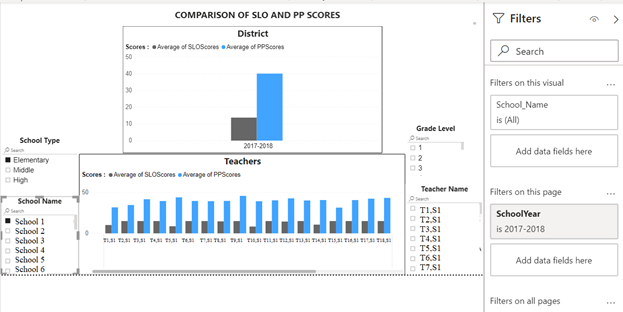
To apply filters to the charts, click on the desired filter checkbox or select the desired School Year filter using the “Filters” pane, as highlighted below. In the example below, the 2017 – 2018 School Year filter and School 1 School Name filter were selected in order to view all of the 2017 – 2018 SY SLO and Professional Practice data for the District (top chart), plus for teachers at School 1 (bottom chart).
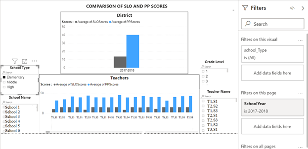
The filter combination of School Type plus Year, shown below, will change the Teachers chart so that it displays only scores for teachers who are associated to that particular School Type in the year that was selected.
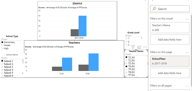
To view and compare data for multiple teachers at once, select the additional filters such as School Type, Grade, or School Name, and then use Ctrl + Click to select multiple teacher names under the Teacher Name filter block as shown below.
Comments
0 comments
Article is closed for comments.